I am a big patron of museums. I go to many of them and try to fit in a visit whenever I am out of town. But what I have seen lately is how they have begun to use the same technologies that entertainment companies have been perfecting for movies and theme park rides, all in the interest of capturing more visitors and increasing visitor engagement. I think this a positive development, and this blog explains its evolution and why it is welcomed.
I have written about this trend before: once for the NY Times when I visited the Lincoln museum in Springfield Ill. back in 2008, and once for HPE’s blog posted two years ago. In those posts, I talk about how the best museum designers combine exhibits involving non-visual senses (not just reading some text plastered on the wall) and using technologies such as RFID and touchscreens to personalize the visit. (I’ll talk about these in a moment.)
You might call this when museums become theme parks. And while this isn’t quite as dire as this might sound, it does show how hard museums have to work to gain notice in this Snapchat world where attentions can shift in a matter of seconds. It also shows how the technology developed for the theme parks (including higher-definition video, complex theatrical control systems and the like) can be deployed in ways to improve learning and make the visits more memorable. These technologies can also help those of us that want to learn more and take a deeper dive into what is being shown in the museum.
I got a preview of the latest example with a new aquarium here in St. Louis that will open next week. The aquarium is part of a major redevelopment of our Union Station, a building that hasn’t seen any scheduled passenger service for many decades and is more than 100 years old. When I moved here more than ten years ago, the building contained a shop-worn mall that had lost its luster. Then a few years ago it began to be redeveloped by its current owner, Lodging Hospitality Management (LHM). That company continued its adaptive reuse with various entertainment improvements: besides the aquarium, there is a Ferris Wheel, new restaurants and an indoor ropes course.
But just saying we have a new aquarium isn’t really doing the place justice. It is probably the most technologically advanced aquarium that I have seen. Its use of technology is done so elegantly that you may not really notice it as you drag your brood through the place, looking at the tanks and the sea life. A preview of what you can see in its tanks is linked here. (There is also this story on a local TV station here.) Let’s stop in and see what is going on.
First is using the latest high-def video in interesting ways. When you first enter the complex, you are in a soaring grand lobby that appears to be sitting at the bottom of a tank, as waves of water wash over you. The wall you are facing has loads of gears and a huge analog clock face, which plays off on that you are located inside a former train station. You then realize that you are looking at various video screens, and some very nice ones at that. The screens are delivering twice 4k resolution. That grabbed my attention. According to Andrew Schumacher, the main architectural designer at PGAV Destinations that lead the project, they spec’ed out the lobby ceiling with projection video three years ago when they first began. “But then LED technology became a better solution, so we made that change.” It is certainly stunning.
PGAV Destinations is based in St. Louis and has been designing various attractions for more than 50 years. They have created exhibits for the Atlanta Aquarium, including building a new shark tank for them. They were excited about creating an entire aquarium from scratch, and were challenged by LHM to incorporate technology in interesting pedagogical ways that combined both “high tech and high touch,” according to Schumacher. I think they have succeeded quite well. When you think about their design challenge, they have to meet three different goals:
- First, the animal or fish has to be comfortable in its habitat.
- Second, the keepers have to be able to do their jobs, feed the critters, and maintain the tanks.
- Finally, the guests have to have something interesting to see.
Balancing these three goals isn’t easy, and given that each animal is unique and that the aquarium has more than 13,000 different “residents,” that adds to the complexity. And the trick is making sure that in the future we still have all of these residents alive and well.
But it isn’t just having tech for tech’s sake. The designers wanted to “bring the visitor into the story, something we learned from Disney and other theme parks,” said Ben Davis, the CTO of MoonDog Animation Studio in Charleston SC. This means you have to craft a compelling story from the moment you purchase your ticket to when you inevitably exit through the gift shop. I think they have succeeded. MoonDog designed the stories that are used throughout the aquarium, something they have done for other cultural institutions. “We were trying to get the aquarium to talk back to you, to bring you an emotional experience and keep you in a state of awe,” he told me. I agree completely. This isn’t your grandfather’s fish tank.
Once we leave the lobby, we then move into what appears to be a mockup of a train car. Instead of the windows on the sides and ceiling of the car, you have additional video screens that take you on the start of your journey to the wonders of the rivers and oceans around you. Once you exit the train car, there are six different major galleries to explore that are defined by various ecosystems, including one that covers the nearby confluence of the Missouri and Mississippi Rivers.
Smart Monkey’s ISAAC show control system runs the screens in this and other areas at the aquarium. You can see this company’s work to operate the media installations such as at the Bradley LAX international terminal (shown here) and at numerous museums around the world, including the Shedd Aquarium in Chicago, the US Mint in Philadelphia, and exhibits at the Kennedy Space Center. This makes it easy to coordinate and operate all the various digital media and to program some very sophisticated special effects.
The ISAAC system at the aquarium is running seven VMs and contains all the digital media assets for the place, along with housing a scheduling system and various databases and workspaces. The key, as explained to me by their director of technology Mitch Schuh, is to enable the graphic and exhibit designers to have tools to make it easier to realize their vision, without having to worry about the underlying networks, servers and other infrastructure. The system also has an active-active failover, in case one system goes down. All of this can be managed remotely via a web portal too, so the aquarium systems can be operated anywhere in the world. “I can think of several cases during the construction of the exhibits where we were able to make quick decisions and adjust show runtimes and make other changes on the fly,” said Schuh. “These would have taken a lot more time and effort without Isaac.”
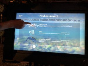
Besides all the HD TVs, there are also touchscreen kiosks. They are popping up at many museums. The aquarium has them sprinkled throughout its galleries, and they are set in an attractive steampunk-like setup.  Why steampunk? This is because the designers wanted to evoke what early 1900s-era train travel was like, paying homage to the early days of the station. These screens can provide a simulated 3D display of the sea life you are looking at, along with a map showing you where you are located and other data such as diet and habitat that can help amplify your visit and provide more context about what you are seeing in the tanks. They are also used to support a personalized game designed for kids visiting the museum. (More on that in a moment.)
Second is its use of music and sound and lighting effects. In my walkthrough I met Michael Gleason, the head composer, who told me that he had written more than 75 minutes of music that will play in different galleries and for different situations. That is more than many feature films have and is indicative of the sensory experience they are aiming towards. But it isn’t just the sound effects, but its combination with theatrical lighting too. I first saw this in the Lincoln museum, but the lighting is used in our aquarium in more clever ways to amplify the music you are hearing and what is swimming in the tanks in front of you. These digital assets are part of what the Isaac show control systems are managing.
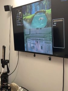
 Next is animation along with virtual/augmented reality. One of the exhibits is the three otters that live there, and of course they are named Thatcher, Sawyer and Finn. There is another animated one called Tommy that you can interact with is manipulated via computers. This was created by the folks at Groove Jones. Tommy is next to the same gallery where you can see the real ones swimming around. The human operator has cameras to judge the audience response and answer their live questions. Like the Wizard of Oz, the operator is manipulating the controls in a hidden booth. There is also a sandbar touch tank that has a layer of projected video on it, making it more enticing and interactive for the visitors. The goal here is to engage the visitor and have them literally get their hands wet exploring the life aquatic.
Personalization is also a big plus. When I visited the Chopin museum in Warsaw, we got a RFID tag that would allow us to hear the content in our language of choice, along with further personalization depending on our age and musical sophistication. Museums are getting smarter about making these visits more personal. A good example of this can be found at Atlanta’s College Football Hall of Fame. When you purchase your ticket, you get a lanyard with an RFID chip that is set to a particular team and player. As you move around the museum, you see statistics that are filtered which are relevant to that player. At the aquarium, children get RFID cards that are age-matched and allow them to participate in a scavenger hunt and knowledge quizzes with results that get posted to their profiles.
Sometimes the personalization doesn’t have to be too high-tech: if you visit one of the Titanic Museums in either Branson or Vegas you will be given a random paper “passport” to allow you to assume the identity of one of the passengers. You get to find out where that passenger lived aboard the ship and whether they survived the accident.
We have come a long way since museums started using AcoustiGuide technology to play recordings of their curators explain their collections to us. MoonDog’s Davis sees one way to make this tech more location-sensitive, to further increase personalization and as a way that it could be driven by an ISAAC or other show-control system. He sees that movie producers and museum curators are converging, so that visitors can create their own stories with their visits.
There is a fine line between putting so much sensory information in a museum that it can overwhelm and defeat its purpose of improving the visitor’s experience. You do want to leave time for visitors to think about what they are seeing and hearing and feeling. While I am excited to see these other, non-visual, elements appear, I do understand that you need to integrate them carefully and ensure that you aren’t becoming a theme park version of the museum. I welcome your own thoughts about this. Please share other examples of museums or places that you have been that have resonated with you in the comments.
 Finally, case studies can have a visual element, as this piece on rebranding cranberries for the millennial generation did. The folks behind marketing this seasonal fruit used the fascination that millennials have with taking pictures of their food to put together a nice social media campaign last Thanksgiving that moved what many consider a boring traditional dish into the spotlight.
