IBM and Akers, then and now

With the passing of John Akers last week, I was reminded how very different the IBM of today is from the company that I began covering when I first entered tech journalism back in the mid-1980s. Back then, IBM was a hardware powerhouse: key innovations in chip design, the first hard disk drives, PC networking, and more all came out of IBM’s research labs. Back in the 1980s, IBMers were frequent Nobel prize winners. They also wore white shirts and dark suits with rep ties to work. How many of you even know what a rep tie is, let alone seen one lately on anyone in your IT departments?

Almost none of that effort remains in the IBM of today. Hardly anyone gives token ring networks a second thought: Ethernet and its descendents won that battle long ago. Indeed, IBM got out of the PC business years ago when it sold off its assets to Lenovo. The chip designs that IBM invented are now popular in almost every other vendors, including Intel. IBM mainframes now run Linux, in addition to the languages and programs that I was familiar back in the 1980s.

Today’s IBM is all about software. Its Websphere and SoftLayer groups are growth areas for the company: both came out of acquisitions mixed with lots of internal development.

akers-john0001Akers presided over IBM at the peak of its population — some 400,000 people worked for him at one time but that was a major issue and unsustainable. By the time he was forced into retirement in 1993, about a quarter of this workforce was gone and thus began the great transition into a software company.

Despite these layoffs and running IBM during some turbulent times, Akers was the head of IBM when it was leading the PC revolution in corporate America. While he wasn’t in charge when the IBM PC was introduced back in 1981, he did oversee the expansion of the PC’s first decade. At Transamerica Life Insurance where I worked in the end user support department, it was heady times as we bought thousands of PCs for our knowledge workers. While IBM didn’t have the most innovative PCs, they had a solid brand awareness that made corporations initially comfortable with purchasing them.

IBM had some spectacular failures in the PC business back then too: the PCjr, the PS/2 with its proprietary hardware bus, the aforementioned token ring networks, and a misguided attempt to unify PCs with the first digital phone systems. But its presence in the PC business ultimately led to the success of Microsoft, Intel, Apple, Sun, Oracle and thousands of other companies that make up the industry today. The IBM PC was revolutionary at the time, not for what it had inside, but for what it didn’t have: any proprietary IBM technology. It was the first piece of hardware from IBM that could be built by anyone out of common parts, and many of its competitors did exactly that. Had IBM come out with its PS/2 or some other proprietary system in 1981, the PC industry would have had to come about differently. Now look at how cheap you can buy a Raspberry Pi device.

Akers missteps had another important legacy: he began IBM’s transition to a software company. Since those early days, IBM has had dozens of acquisitions including Cognos, Lotus, Tivoli, Rational, FileNet, Internet Security Systems, SPSS, CastIron, and BigFix — many of these were billion-dollar companies that are probably not familiar to you now. Software is now about a third of IBM’s overall revenues, and its hardware business continues to decline.

But while Akers ultimately couldn’t change IBM by himself, he did a great job mentoring many people who did, including his eventual successor Sam Palmisano and Steve Mills, who runs its software group. And now IBM’s head is Ginni Rometty, its first female CEO. I don’t think she wears a rep tie either.

Vine+Twitter: How Ferguson has created the modern newsroom

Ferguson-missouriI have a lot of complex feelings about what is going on a few miles to the north of me in Ferguson, Mo. I have been to this leafy and hilly suburb (an image that you probably wouldn’t get from all the news reports this week) a few times, including last weekend when my wife and I went with a few friends  for breakfast to help support a local diner.

I am not really qualified to talk about the social tragedy, much as I would like to weigh in. Instead, let me share some observations about the way the media has covered events of the past week, tempered by the fact that I live in the metro area and have some local knowledge. Here are some key takeaways for tech folks:

The major television networks can’t get close enough to the action to be effective reporters any longer. Citizen journalists have played a big part in getting the word out as to what is actually happening on the street. One example is Mustafa Hussein who reports for a local Internet radio station. He quickly pressed into service a video camera which made him fleet of foot and being able to maneuver around the demonstrators much more nimbly than network cameramen and satellite trucks. The camera was damaged in his coverage, BTW.

A corollary to the above is that the networks either over or under-cover fast breaking events, and especially ones where they can’t move their resources fast enough to do a decent job. Even our local St. Louis stations have taken several days to figure out where to position themselves during the day and night, whom to interview, and so forth. If you are still trying to track things, a better place is to start with this great Twitter list of people to follow on Ferguson happenings.

Vine combined with Twitter has become an effective distribution mechanism that can rival the AP newswire in terms of timeliness and compelling content. The work of our city councilman (we call them alderman here) Antonio French is particularly exemplary with his frequent posts.  He was a popular social media figure before the riots, but he has more than quadrupled his followers from 25 thousand to more than 110,000 followers in the past week. Of course, vetting the accuracy of these posts can still be vexing. But the immediacy of a six-second video clip is hard to dispute. I must admit that I had ignored Vine until now. My bad.

Reporters are no longer a protected class of observers. The downside of having more citizen journalists are that they are just as much at risk of being attacked by the demonstrators, gassed by the cops, or even arrested (as French and Hussein both were this week). The reporters that were arrested were released without being charged, but still cops need to have more training about how to distinguish and recognize them. (I will resist saying anything more about out the extreme irony of our President chiding the police for arresting reporters.)

Still, a place isn’t just a Twitter hashtag. Even the normally clear-thinking David Carr for the New York Times mistakenly says in an otherwise excellent article, “nothing much good was happening in Ferguson until it became a hashtag.” Au contraire. With all the posts containing #Ferguson, there are still far too few stories about how many of the local businessfolk are trying mightily to survive in the 95% of the rest of the town that looks like any other American suburb.

Network World: Citrix Xen Mobile rates a spot on your MDM short list

xen phone security optionsWhen we reviewed six mobile device management products for Network World back in 2013, Citrix declined the opportunity to participate, but the company has changed its mind with the recent release of Xen Mobile v9.0 MDM. In our testing, we found that the software stacks up nicely against AirWatch and Good Technology, the two leaders from that review, and should be on any IT manager’s short list, particularly if you already use other Citrix connectivity products. (A view of its extensive security options can be seen on the right.)

You can read my review today in Network World here.

Computerworld: Peak vs. Tibbr, two communication tools reviewed

peak activity graphs1If you are trying to have more effective team communications, you are probably looking at products or services that go by names like “social CRMs” or “team engagement tracking apps.” Regardless of what they are called, these apps can connect to a variety of social networks and email accounts and make it easier to manage your communications, track what your team has posted, understand what other team members are working on and improve workflows and productivity by avoiding interruptions or massive amounts of email.

I tried out two of these tools, Peak (shown above) and Tibbr. Both are browser-based: Tibbr also has mobile and desktop clients. You can read my review in Computerworld here.

ITWorld: Should You Hire a Data Artist?

A growing number of companies are looking at new ways to display their data and turning to the art world for assistance. Some of the bigger tech companies such as Microsoft, Google are bringing in the data artists from museums and galleries and putting them to work with developing new visualizations that can help explain their message, promote company awareness, and help out with the marketing efforts. It is certainly a growing field. The New York DataViz meetup has grown to more than 1800 members, and there are similar groups in cities around the world too.


Fine art and data visualizations aren’t a new combo by any means. Sheldon Brown’s video installation Scalable City was shown in 2008 at San Francisco’s Exploratorium and can be seen in this video online. There are numerous graphic artists that have been working with computer code and modeling data for years such as Jon Phillips (rejon.org) and Golan Levin (flong.com). Many have exhibited at other museums and galleries around the world.

And some data visualizations are very artsy, unintentionally or coincidentally. Hans Rosling has been wowing TED audiences for years with his animated bubble charts of world economic development. (Yes, that sounds odd but they are really quite beautiful.) And look at these Lego constructions illustrating immigrant migrations, or this very useful graphical display of the world clock, showing overlapping office hours among three cities from Dark Horse Analytics.


Microsoft has even spent some time fixing up their user experience and product design according to the artistic ethos of the Bauhaus modern art movement from the last century. Steve Clayton describes in one of their blogs: “The Bauhaus movement had one of its focus on making the function beautiful. At the heart of the Bauhaus philosophy is stripping away superfluous decorations to focus on the essence of the functional.


But as more companies hire data scientists, the trend is to also bring in a new kind of employee that some refer to as “data artists” – and these people take on major roles on product management teams. For example, Aaron Koblin now works at Google and gave this TED talk on show of his data art projects.


Jim Sterne from Anametrix (a big data visualization tools vendor) has posted on their site a good working definition: “A data artist uses data streams and advanced analytics systems in the same way a regular artist uses oil and brushes, stone and chisels or wood and carving knifes. A data artist must be a master of all digital media –ad networks, email campaigns, YouTube channel measurement and more – to create valid insights worthy of using as foundations for business decisions.” That is a great start.


Perhaps the pre-eminent data artist, judging by his resume and how many talks he has given before techie audiences, is Jer Thorp. He has done a TED talk that shows off some of his work for the New York Times, Wired magazine and other organizations. I met him at a talk that he gave at a public event last month that was sponsored by the St. Louis Regional Arts Commission, an umbrella arts funding and advocacy organization and gallery and meeting space.

Thorp had a lot of quotable comments from his talk. “Twitter is the fruit fly of social network research, because it is easy to use and observe patterns.” A lot of his work has been analyzing Tweets, including as part of a team at the New York Times called project Cascade. It was created a few years ago to help visualize the lifecycle of a news article and how it was shared across social media. On their website, you can see sample time-series visualizations about significant news stories, such as Chelsea Clinton’s wedding or when that errant flight attendant used the evacuation slide. The idea is to help the Times staff and others figure out influential social posters – what they call “Tweeter Zero” and how to find these people on particular subject matters.


Thorp says that “data is bleeding into our popular culture,” and data artists are best used to help make that transition for any business that wants to appear modern and hip. For example, he created an art installation at the New York Public Theater, home of the outdoor summer Shakespeare festival offices. The work is a collection of several dozen LCD displays that continuously scroll various lines from the Bard’s plays. The ancient language literally comes to life across the various screens.


Thorp continues to work on new and innovative projects and is spending the next year working as data artist in residence for the Center of Creative Arts, which offers a series of multidisciplinary and multicultural arts programs for the St. Louis community. Kelly Pollock is their Executive Director and heard about some of Thorp’s projects. She applied for a grant from the Regional Arts Commission to fund his residency and she spoke to me about what they are trying to accomplish. “Data and the arts are not a very comfortable combination; it is like putting on a very itchy sweater. There has always been this tension on how we tell our own story or communicate our impact. Thorp’s angle was so interesting, especially in the human narrative. We have amazing success stories and want to have him address how we can use our data and tell our stories to the community in a more meaningful way.” For example, Thorp could develop a dance, sculpture, or some other performance or presentation as part of his residency.

So how should businesses work with artists to better visualize their data? Here are some suggestions.

  • First, as Thorp suggests, “bring an artist to work on your data as soon as you can.” Set up something creative: it doesn’t have to be a web page but can take the form of something in your lobby, like the Public Theater’s Shakespeare device. (Google has something similar in some of their offices.) Thorp talks about how data visualizations have two broad purposes: for data reduction, which are summary graphics that are suitable for annual reports; and for data revelation, which show something that has never been seen before. You need both types to have great art.
  • Thorp constantly reminds his clients not to confuse data with the actual real-world conditions. Don’t get mired in the nitty-gritty details, or get stuck in the data mining process. And don’t get caught up in producing a meaningless pretty picture either. Find the middle ground, where the art can stand on its own but still provide some interesting insights. A data artist “should share opinions and hold back the numbers for reference, if needed,” says Sterne.
  • Avoid “Death By PowerPoint” presentations. This is something that we all can get behind. Data artists can help improve the overall presentations of data, and there has been an “extreme presentation movement” for years to try to get others to learn how to do it. Here are ten suggestions on how your can improve your slide decks by Dr. Andrew Abela, who is Chairman of the Department of Business & Economics at the Catholic University of America in Washington, DC.
  • Focus on telling stories and helping how others in the business can achieve their goals. Tie your insights into the corporate bottom line where it makes sense, and don’t just think about producing a report but instead create an object of interest and wonder. Who knows: your next data art might make it into a museum collection after all.

AT&T Blog: Network Security, The Moving Line of Defense

lock-and-key-icon-thumb355812The days of defending the perimeter are over. Look at what happened to a major retailer in late 2013 as an example. Someone posing as a trusted contractor was able to enter the retailer’s network and do all sorts of damage — to the tune of 40 million compromised customers. This attack occurred because the retailer wasn’t looking at insider threats carefully enough. Indeed, the perimeter has become more and more porous, and network defenses based on this traditional barrier are no longer enough to protect an organization’s business interests and objectives

You can read the post on AT&T Networking Exchange blog here.

ITworld: Data artist in residence: Why your data needs an artist’s touch

jerAs more companies hire data scientists, there is a corresponding trend to hire a new kind of employee that some refer to as “data artists,” whose job it is to tell the stories behind the data in the most accessible and revealing ways. And these folks are taking major roles on product management teams, such as Jer Thorp pictured here. In this story for ITWorld today, I talk about what is a data artist and how Microsoft and Google and the New York Times are making good use of them.

Network World: How Aryaka’s global private network speeds access to Internet apps

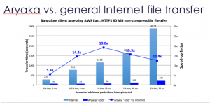
arayIf you are trying to improve global access to your applications, you have probably considered one of several solutions: stringing together your own private network, purchasing WAN optimization appliances, or using a managed cloud-based service provider. Figuring out the benefits of each solution isn’t easy and it is hard to test for variations in Internet connectivity, specific applications and other conditions.

But what if a vendor could show you exactly the benefit in a particular use case, so you could understand what they are delivering? I got Aryaka to do just that. You can read my post in Network World today here.

Computerworld: Working together: 3 new team collaboration tools, Glip, Flow, and Slingshot

The concept of how we collaborate is changing. Better tools are being developed that help workgroups put together documents, quickly schedule meetings and chat with each other. Today’s collaboration environment includes tools for text chats, bulletin boards, video conferencing, screen sharing and scheduling meetings. Among these are a number of lightweight products that offer quick and near-real time collaboration. I looked at three of the newcomers: Flow, Glip and Slingshot. (A screen from Flow is pictured above.)

While all have some things in common — all three seek to enable collaboration and can be used either on desktops/laptops or on mobile devices — they all do somewhat different things in the collaboration space.

You can read my review that appeared in Computerworld here.

Playing With Dolls 2.0

a1What do Marie Curie, Ada Lovelace and Bessie Coleman have in common? If you need another hint, how about what these three have in common with Addy, Caroline and Kaya? Still not sure? All of these are names of dolls.

Yes, Curie et al. are also real people, and therein lies the genius of what two young women entrepreneurs are trying to do with a new venture called Miss Possible. They plan on making a line of dolls based on real-life women who have accomplished a lot in the STEM area. The notion is to encourage girls to discover the fun in this technical area by celebrating women of the past who have had ground-breaking roles: Curie in science, Lovelace in computer programming, and Coleman in aviation (she was the first American to receive an international pilot’s license, and the first black woman to barnstorm back in the 1920s).

In order to pull this off, you need more than dolls: you need a backstory for the doll, something that American Girl has known about for some time. If you aren’t familiar with this operation, they have stores in major cities around the country where little girls can go in with their moms and end up spending thousands of dollars on matching outfits for the three of them, accessories, and more. They also are the source of the three other names that I mentioned above. Girls can choose a doll based on her story and costume and take it from there.

Miss Possible is trying to do something not quite so capital-intensive. Their dolls’ backstories are accomplished with a smartphone app where you can conduct science experiments (Mentos and Coke, anyone?), learn more about the doll’s namesake, and provide games that the kids can play. Not to mention use different outfits (Curie comes with a lab coat, of course.) It is very ambitious but such a great idea. I wish my daughter and stepdaughter had something like this back in the day when Barbie and Skipper ruled the nursery.

The backstory of the entrepreneurs is also interesting: both come from STEM-oriented families and both have pursued careers in STEM at the University of Illinois in Urbana, the home of the real Mosaic Web browser and the fictional creator of the HAL 9000 computer, among many other things. They are still at the idea stage and are looking for funding their company through the crowd. And they are smart about their project: everyone who backs their project, at whatever level, will get to vote on the fourth and presumably subsequent dolls selected.

You can read more about what the Miss Possible gals are doing and help fund their IndieGoGo project here. I made my donation, and hope they meet their goals. It is about time our kids had other options to play with dolls.