A Letter from Budapest

IMG_0963I spent this last week in Budapest, thanks to Balabit, a Hungarian security software company, and fell in love with the city and its people. (Here are more of the photos that I took of the town.)

Budapest has an interesting mix of old world charm and new age coding: a vibrant startup scene that is just taking hold. While I estimate that it is four years or so behind where I see things in St. Louis. That isn’t a knock on their innovation or spirit, just more a comment on their available support infrastructure. Hungary isn’t completely in tune with the notion of startups as economic development: there are crazy laws on the books that don’t encourage new businesses and seem to date back to the Soviet era when full lifetime employment was the goal. But that just means their startups are more determined to succeed. Call it Silicon Goulash, perhaps?

Hungary has a fascinating and long history of innovation. Many of its citizens were prominent mathematicians and physicists, including the Intel founder Andy Grove and the grandfather of computing himself John Von Neumann. The carburetor, the transformer, parts of the first telephone exchange, the first synthetic vitamin, the modern CRT, Rubik’s cube and the ballpoint pen all came from the minds of Hungarians.

IMG_1018Speaking of the Soviet era, Hungary was also ahead of its time in offering long-term asylum to political refugees. Cardinal József Mindszenty was the leader of the Catholic Church who was imprisioned and then lived in the US Embassy in Hungary for 15 years before being allowed to flee in 1971. Does this sound familiar?

I found Budapest a very walkable and livable city. It has hundreds of outdoor cafes packing dozens of pedestrian streets; something that we so desperately lack in the States. It has a terrific riverfront on the Danube with bikeways galore and an island park in the middle of the river that has my favorite water park ever. And speaking of water, there are dozens if not hundreds of thermal baths that span centuries. You can see why I enjoyed my time there so much.

Ostensibly, I was there on behalf of Balabit to meet with their executives and see their products and story. The company is behind the open source log aggregator syslog-NG and other security products, and has been in business for more than a decade. But while I was there I also met with other IT firms, including Electool.com, Graphisoft and Metta.io, and also visited with Prezi.com.

Prezi, the alternative SaaS-based presentation delivery tool is one of three software companies to have become an international success, along with LogMeIn and UStream. The three of them originated in Budapest and still have decent-sized development offices there.

Of the three, LogMeIn is a public company, while Prezi and UStream are private. All three have attracted tens of millions of dollars in A-list Silicon Valley venture funding. UStream and LogMeIn both have several offices around the globe in addition to the ones in Budapest and America.

The three firms got together to recently produce the well-attended RAMP conference about how to scale up your software architecture, bringing in experts from around the globe to Budapest.

And founders of the three firms have also put together their own nonprofit called Bridge Budapest to offer fellowships and internships at major software companies to Hungarians, and for the rest of us to come to Budapest and intern at one of their companies.

IMG_1057While I have tried Prezi several times over the years it has been around I never have been able to gain much traction with the tool. Maybe it is just the way I work or my speaking style. But their offices are an interesting twist on the typical tech startup playground: they have recently moved into a Beaux-Arts building with the top floor a former telephone equipment room. It is a fitting place for a modern tech startup.

Tech isn’t the only thing happening in Budapest. I met an agribusiness manager one night. He just moved his family from the Midwest to Budapest. His company does a lot of business in Eastern Europe and Russia, and wanted a stable place to have an office. “To Western Europe, we don’t look all that stable a country,” said another entrepreneur to me. “But to the east, we look rock solid. It is a nice position to be in.” Hungary is in the EU but doesn’t use the Euro: its currency is the Forint which sounds very Princess Bride-like charming to me.

Budapest is also home to the Soros-backed Central European University. It was the first on the continent to offer an American-style MBA several years ago and now has a budding entrepreneurship program, a business incubator and courses that seem quite current with promoting startups and what one could find in the States.

Speaking of schools, if you know someone who is a CS/EE student and is looking to study abroad, take a gander at this program that is offered by the Aquincum Institute of Technology (and where Rubik himself teaches).

I asked several people about the tax situation in Hungary and got a range of responses. One source told me, “our tax and legal system is so wonky,” and complained that half of one’s salary is taken in taxes. Another source said while this is true, the tax rate is less than it has been in recent years, so things are improving.

If you have a chance to visit, I think you will be as excited as I was. And if you would like an introduction to the companies that I mentioned, let me know.

ITWorld: How to choose a social media management service

How do you know you are fully engaged with all of your social networks? This turns out to be a difficult question to answer. And as we try to resolve complaints from customers on Twiter and Facebook, we also need to track mentions across other networks and develop consistent workflows and processes to respond and measure these involvements.

Luckily, there are tools available for these tasks, and you can read my article in ITWorld here that reviews many of the issues involved before purchasing one.

Solution Providers for Retail: Gaming Replacements for Captchas

You are probably just as annoyed as I am when you encounter those cryptic blocks of text called “Captchas” (the acronym stands more or less for Completely Automated Public Turing Test to Tell Computers and Humans Apart). There must be a better mousetrap, particularly for online retailers that are looking to distinguish themselves and cut down on their shoppers’ frustrations as they navigate their sites. A company called PlayThru has one: they embed a small Flash or HTML5-based game that a human plays with a mouse to prove you are really are a carbon-based life form.

Part of the problem is that the bad guys are escalating their own solutions to defeat the Captchas. They pay actual humans a very low wage to enter the text in massive boiler rooms, run optical character recognition software to figure out the codes, or some other machine-based algorithm. All of these approaches have made Captchas more painful and less usable. (Here is a great collection of the worst of them.)There is research that suggests it takes the average person several attempts to successfully complete a Captcha request, and close to 25% of Captchas are solved by bots today.

There must be a better mousetrap, particularly for online retailers that are looking to distinguish themselves and cut down on their shoppers’ frustrations as they navigate their sites. Scientific American covered some of these alternatives here last year.

One that is catching on and could be useful for VARs looking to expand their practice areas is from a company called PlayThru. They embed a small Flash or HTML5-based game that a human plays with a mouse to prove your really are a carbon-based life form. It is intriguing, and has captured (if you will excuse the pun) more than 4,500 supporters in the past nine months already.

The Play Thru concept is pretty clever: you have to interact and identify objects with your mouse and keyboard, or drag and drop particular objects such as pizza toppings or food from a fridge. As you do so, the algorithms monitor your actions and find the tell that you aren’t a bot.

The company serves up 20 million miniature games each month and “the algorithm hasn’t been defeated yet,” said co-founder Reid Tatoris when I spoke to him in late February. “We are constantly looking at how people are interacting with our games and we write our own bots to test them too,” he told me. What made Play Thru’s games work is that the developers tackled the issue as a usability problem first and foremost, and then made sure the security was ironclad. Most of the Captcha deployments were steeped in security and thus the miserable and virtually unusable result that we are saddled with today.

The proof is in the pancakes, so to speak. They have seen conversion rates improve by 40% over the traditional text-based Captchas, which means fewer abandoned shopping carts and more real shoppers who can conclude the shopping process.

PlayThru offers a free plan along with two paid plans, including a white label plan at $79 a month that includes phone support and would make the most sense for VARs looking to implement this technology. There are plug-ins available for WordPress, Jooma and Drupal and code libraries for Php, Perl, Ruby, Python and Java to make installation easier.

Why eWallets still are bad news

I had a chance conversation with one of my neighbors recently where one of them casually mentioned that they have never bought anything online. Ever. That gave both my wife and I some pause. Not that we are big shoppers, on or offline: but we both think of online shopping as a natural extension of what we do, like breathing. We even know people who buy furniture online, which I think a bit risky.

Against this backdrop, there are yet another round of eWallet innovations that are destined to make the mistakes of the past. There are multiple solutions, usually involving your smartphone and a payment provider, such as the recent announcement from Visa and Samsung. Then there was the deal between Starbucks and Square so you could pay for your lattes by tapping your phone near the register at checkout.

A lot of this activity is motivated by having more near field communications on our phones, meaning we don’t need physical contact to conduct a transaction. While that is very sci-fi, it isn’t going to motivate people like my neighbor to start conducting ecommerce. Let’s go to the video tape of the past botched plays.

I dredged up an op/ed piece that I wrote 14 years ago for Computerworld where I concluded, “If you have a Web storefront, steer clear of e-wallets for now. Let your customers pay you as easily and as quickly as possible.” That advice still holds true today.

To set the context for this piece, you need to know that Microsoft had its eWallet software as part of Windows 98, and during the latter part of the 1990s there were probably a dozen or so vendors who were developing Internet payment schemes of one sort or another. Only Paypal survives from this era, and ironically they had their origins as a piece of software that was used on Palm Pilots to beam payment information using their built-in infrared technology. Many of us consider the contact manager on the Palm still better than anything we have today, but that is a fight that I will leave for another day.

So what happened to all those payment companies? They made several mistakes.

First was the chicken-and-egg of non-universal coverage and too many “standards.” I wrote back then: “Imagine going shopping at a physical mall store and getting ready to pay, only to find out that the store accepts one obscure credit card issued by a single bank in Tuvalu. How long do you think that store would stay in business?” Exactly. All these vendors need to get around one solution, and do it quickly. Imagine how long credit cards would have lasted if you needed separate machines to scan your Visa, Mastercard, and Amex at the checkout line.

Second is that credit/debit cards just work too well. We all have them, we all carry them with us at all times, and we all know how to shop with them. Trying to compete with this universal solution is madness. Indeed, they have largely replaced the need for actual cash. I remember when my dad wouldn’t leave home without several hundred dollars in his wallet. Even when I travel, I rarely have more than $20 or $40 in mine, and usually a lot less. Everyone takes plastic nowadays.

Next, I don’t want to manage yet another cache of cash. It is bad enough that Paypal exists, and that I have to track what is in my account and how quickly I can get any dollars in or out of it when I am buying or selling something. Why do I need yet another account to manage?

The last straw is that I usually need a specific piece of software, browser version, or phone. Check out what you need for the Google Wallet: “an NFC enabled Android device with a Secure Element chip running the most recent Android operating system.” That isn’t a very long list of phones, none of which I currently own. We tried this before and the number of variations means that almost always you don’t have the right mix of things to access your eWallet some of the time. See my remark about Tuvalu above. And note the roll call of failed Internet payments companies of the past too.

So our phones may have gotten smarter with all sorts of new protocols and wireless radios, but ultimately the real gating factor in having the carbon life forms suffer through using them, same today as back in 1999. It is not too late to learn from the past.And maybe sometime soon my neighbor will feel confident enough to buy something online.

Social media companies need to practice what they preach

Sometimes, it is those of us in the tech industry who are our own worse examples of actually using the technologies that we have created. Take the example of tools that variously go under the headings of sentiment analysis, social CRM, engagement measurement, social media management, enterprise listening platforms or social media marketing. These things help you figure out when you should Tweet or post, who is most influential among your social networks, and what conversations you should pay attention to. They offer pretty dashboards and real-time data feeds so you can control the social conversations around your brand.

I am starting a project for Network World reviewing these tools. So far, I have found nearly 100 of them, but I can only review 8. But that isn’t the problem. My issue is that I would expect that these vendors would be sterling examples of how to engage their own audiences. Not true, no way, sorry to say.

Example #1. By now, it should be obvious that a software vendor should make it easier for their potential customers if they actually want to purchase their product. So how about putting a phone number on the home page, just in case someone wants to call? Less than half of the vendors do this, or make it so hard to find their contact information. Almost all of them use Web forms that you have to fill out, which is less than satisfying because you have no recourse if you don’t get any follow up. One vendor takes you to a form on their Facebook page, which is interesting but not very helpful.

Example #2. The same should be true for displaying a press contact. Again, less than half of the vendors have this information, or make it so hard to find. Others, such as Google, ignored my emails entirely. Written on one vendor’s press page, I had to laugh: “Hi! We love you, you dashing citizen of the fourth estate. Even though we don’t know you personally yet, I can tell we’re going to get on famously. Can I get you a drink?” Now we are talking! While you don’t have to buy me a beer, it would be nice if the press contact was in plain sight.

Example #3. How easy is it to find these vendors on Twitter? You would think that placing a little bird icon at the top of their home page linking you to their Twitter accounts would be easy. And indeed, most of them (but not all) do include this information somewhere on their sites. One vendor had a broken link that didn’t take them to their Twitter account but someplace else entirely.

But let’s go beyond actually having a link to the ID, and see how engaged they are with their accounts. It is a spotty record, to be sure.

Some vendors have thousands of Tweets and followers, which is what you would expect from people in this space. Hootsuite is the Justin Bieber of social media tracking tools with more than four million followers, and dozens of daily tweets. (He is at 31 million, BTW.) The major vendors in this space, including Google, Salesforce, Oracle and Adobe, also have big followings and lots of tweets.

But when you get beyond the big guns and look around, it is disappointing. Very few of these vendors actually use their own products to track engagement and mentions. I started posting tweets with the vendor Twitter IDs (once I found them), asking them to get in touch with me. A very small number of vendors responded at all. An even smaller number started following me or sent me messages saying they wanted to help my project. How do these vendors expect anyone to use their products if they don’t track their own brands? Hmm.

Many of these are software efforts from marketing companies, or ad agencies, or others who should know better. Or so I thought.

Example #4: Pricing. I have written before about those vendors that don’t want to put pricing information online, but the social media tools that I am looking at really try to obfuscate their pricing. Perhaps because every deal is a custom negotiation, perhaps because they just don’t want you, the customer, to know. In this particular and chaotic market, prices vary all over the place. Some tools are designed for single users while others are geared for large teams. Some have freemium models, others have one-time fees like traditional packaged software.

socialvolt pricing pageThere was one site that had an explicit “Pricing” tab at the top of their home page: I thought, at last! When I clicked on it, I came to a page that had all sorts of details about the various plans they offered, but no dollar signs anywhere to be found (See above).

Gremln is an exception: they actually put their prices right at the bottom of their home page. Kudos to them. (No phone number, though.)

As I said, I am just starting out on this project for Network World. If you have any experience with these products, send me a tweet or an email. And if you want to see my collection of vendors, I have put together a list here.

Social Media Business Smarts at Dell

IMG_0661
This week I was at DellWorld moderating a panel featuring two Dell social media managers:

  • Richa Verma, who is the Director of Social Media for Applications and BPO Services
  • Richi Dave, who is the Executive Director for Business Digital Marketing.

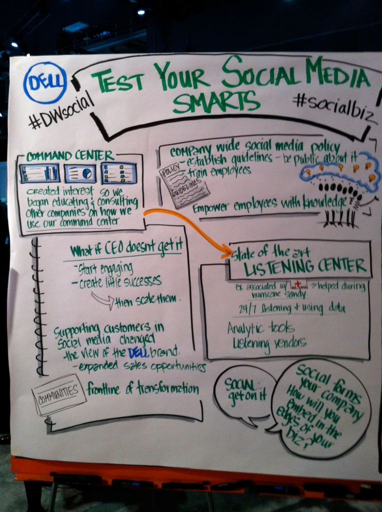
You can see some of the things that we spoke about above. Dell is doing some great things in social media marketing and it was fun to talk to both Richa and Richi about what they are doing.


Dr. Dobbs: Doing a Website Usability Survey Right

surveysA well-constructed usability survey can reveal what your users actually want. Here are tips from an experienced designer on putting together a solid survey, and online tools to help.

A site developer needs to know when to listen to their users, and one of the best ways is to survey their likes and dislikes. But putting together solid surveys isn’t always intuitive. Luckily, there are user experience experts such as Caroline Jarrett and various online tools to help.

Surveys now are cheap and easy to do. I receive requests to answer various surveys almost one per week, and I am sure you do as well. But before you start down the survey path, figure out first how you are going to get respondents, and how to make them trust you. Make sure your request looks legit, and that you aren’t just collecting email addresses for spamming them later with other requests. Include some form of reward up front so the respondent is motivated to help you.

Jarrett’s presentation (and upcoming book) are full of great ideas on improving your surveys. Your survey should ask about a recent and vivid experience, because people tend to forget things over time. Ask one question at a time, rather than putting them together into a compound and confusing question. Don’t worry too much about the number of individual points on your rating scale: whether to choose five or seven or an even number, your respondents don’t much care. Do put effort into the “other” category to make it easier to answer or to collect responses that you hadn’t thought of. Keep the preamble information short and sweet, so your respondents don’t have to page through a lot of preliminary screens before they start answering your questions. And don’t collect your demographic data up front, but at the end when a respondent is more likely to fill out this sort of information.

Spend some time perfecting your questions, and testing them quickly to see if you are going in the right direction. This is called pre-testing. It also helps to review all your questions before you field your survey, and make sure that you really need all of them in the final survey. Sometimes you won’t know what to do with the information that you collect on a particular question, so drop it from your survey for this round: you can always field another survey in the future once you figure out what to do with this additional question.

Take a moment and go online and search for “worst survey questions ever.” That will open your eyes to some of the worst examples and things to avoid.


Getting Web Navigation Right

When putting together your website pages and menu structure, you have to decide how to organize the content and figure out what goes where and under which menu and topic labels. In the past this was mostly an ad hoc process that involved a few people sitting around a table guessing at how your content should be organized. But now there are online tools that can help you test your website to see if your choices were the right ones, or if there is some other organizational structure that would make more sense for your visitors.

There are two broad categories of tools that go under the names of card sort and tree testing. Both can be useful in picking the right way to organize your content. Both types of tools are inexpensive, costing a few hundred dollars per study in most cases, and can be done very quickly online with just a Web browser. The way it works is pretty straightforward: first, you recruit a sample of end users for your research and collect their email addresses that you will use to send out invitations. For card sorts, you collect anywhere from 30 to 50 different content labels or particular item names that you want to include in the organization. They should be as granular as possible, to make the process easier. Then you set up your test on one of these card sort sites:

  • OptimalSort
  • UserZoom (which also can be used for tree tests)
  • WebSort.net

There are two different types of card sorts, open (meaning you ask your participants to specify the categories that you want your items sorted into) and closed (meaning you provide the category names).

You run your test for a period of time and then collect the results. Once you have a recommended list of categories and their groupings, the next step is doing a tree test on as complete (as possible of the) navigation structure of your proposed website. Do your users agree with the selections that you have made? Or do the proposed categories accurately reflect the content that are included in each one? Or do your users get lost navigating your menus? This element of your research gives users the tasks of finding the particular content on your site, and measuring their success.

Tree testing sites include:

  • PlainFrame.com
  • Treejack
  • C-inspector

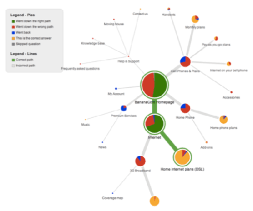
The tree testing results have all sorts of interesting information. The example above shows that, even though most people correctly found the information they were looking for under “Home Internet Plans,” almost half initially selected the wrong menu choice to get there. And more than a quarter who made a correct first selection made an incorrect second selection. More than half of their customers (some unknowingly) got lost within 2 clicks when looking for home broadband service. And when you lose people, you always risk not getting them back.

User experience guru Danielle Cooley has some advice here. “A study result like this shows the team needs to re-examine their information architecture or their navigation labels (or both) to help ensure customers find the information they are seeking. Without a test like this, the team would just be left wondering after the site launch why home broadband sales were down. And, most likely, having to answer to upper management for such a failure.”

Internet Evolution: Understanding Your Research Bias

Oftentimes, when we start out on some research project to understand our site visitors’ behavior, we tend to forget that we bring to these projects our own biases and preconceived notions. I recently attended a seminar by user experience grandmaster Danielle Cooley where she spent some time exploring this topic.

Here are some of her tips so that you can understand your own biases and do a better job when you have to conduct your own research and usability projects.

Cooley breaks down bias into eight different dimensions:

  • Selection bias. This is a very well known bias. The people that opt in for a particular research activity are inherently different from the general population, or those that choose not to participate. Make sure you understand the particular segment of the population that you are examining.
  • Acquiescence bias. Respondents tend to want to agree with the interviewer, because they want to be liked and earn their stipend for taking the survey. Cooley urges interviewers not to be too friendly when conducting in-person interviews, just for this reason.
  •  Social desirability bias. People tend to lie when you ask them sensitive questions, such as about sexual preference or drug use. “They also tend to lie or at least alter their answers when asked about something where their answers would tend to make them look bad,” Cooley says. She uses as an example a survey that asked Bostonians if they walked up a long flight of stairs from the deepest metro station or took the escalator. The results were way off the actual observed practice, because of course most people won’t attempt to climb 200 steps!
  • Central tendency bias. When people are surveyed with a range of answers (from 1 to 10, from approve to disapprove, etc.), they often tend to reply with something in the middle of the range. This can be mitigated by using questions that present both sides of an issue, for example: “Do you prefer or avoid websites that ask for your email address?” with a range of answers that go from “always prefer” to “no opinion” to “always avoid.” The slide above shows an example of a very poorly worded question too.
  •  Confirmation bias. “People tend to believe that a particular set of information supports their existing beliefs or biases,” she says. Cooley cites one political study where both Democrats and Republicans confirmed separate and opposing implications from the same survey results!
  • Reverse fundamental attribution errors. “Traditionally, people blame external circumstances for their own negative behaviors but attribute others’ negative behaviors to particular personality flaws,” says Cooley. But in user experience research, we see the subjects blame themselves for being unable to navigate a particular website or complete a given task, no matter how poor the site design.
  •   Hawthorne Effects. When subjects know that they are being observed, they often change their behavior. The name comes from site of a phone company manufacturing plant in Hawthorne Ill. that was used for several behavioral studies in the 1920s. “Just remember, we aren’t doing peer-reviewed science research here. We are just trying to figure out how to build a better website,” she says.
  •   Evaluator effects. Just because you know all the above biases, doesn’t mean that the survey or research project that you attempt won’t come out differently from one that someone else will attempt.

Knowing these biases is a first step in improving your own field research, and good luck with your own projects.