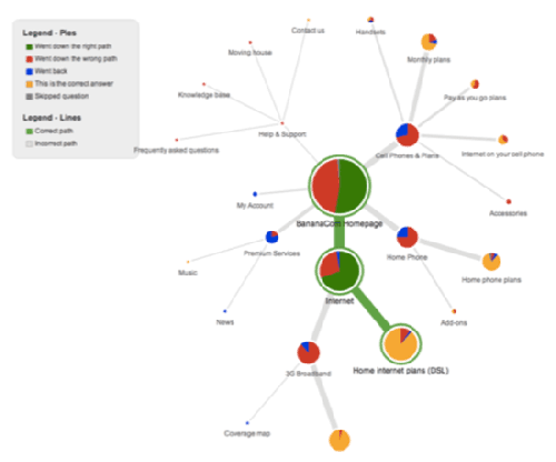
 When putting together your website pages and menu structure, you have to decide how to organize the content and figure out what goes where and under which menu and topic labels. In the past this was mostly an ad hoc process that involved a few people sitting around a table guessing at how your content should be organized. But now there are online tools that can help you test your website to see if your choices were the right ones, or if there is some other organizational structure that would make more sense for your visitors.
There are two broad categories of tools that go under the names of card sort and tree testing. Both can be useful in picking the right way to organize your content. Both types of tools are inexpensive, costing a few hundred dollars per study in most cases, and can be done very quickly online with just a Web browser. The way it works is pretty straightforward: first, you recruit a sample of end users for your research and collect their email addresses that you will use to send out invitations. For card sorts, you collect anywhere from 30 to 50 different content labels or particular item names that you want to include in the organization. They should be as granular as possible, to make the process easier. Then you set up your test on one of these card sort sites:
- OptimalSort
- UserZoom (which also can be used for tree tests)
- WebSort.net
There are two different types of card sorts, open (meaning you ask your participants to specify the categories that you want your items sorted into) and closed (meaning you provide the category names).
You run your test for a period of time and then collect the results. Once you have a recommended list of categories and their groupings, the next step is doing a tree test on as complete (as possible of the) navigation structure of your proposed website. Do your users agree with the selections that you have made? Or do the proposed categories accurately reflect the content that are included in each one? Or do your users get lost navigating your menus? This element of your research gives users the tasks of finding the particular content on your site, and measuring their success.
Tree testing sites include:
- PlainFrame.com
- Treejack
- C-inspector
The tree testing results have all sorts of interesting information. The example above shows that, even though most people correctly found the information they were looking for under “Home Internet Plans,” almost half initially selected the wrong menu choice to get there. And more than a quarter who made a correct first selection made an incorrect second selection. More than half of their customers (some unknowingly) got lost within 2 clicks when looking for home broadband service. And when you lose people, you always risk not getting them back.
User experience guru Danielle Cooley has some advice here. “A study result like this shows the team needs to re-examine their information architecture or their navigation labels (or both) to help ensure customers find the information they are seeking. Without a test like this, the team would just be left wondering after the site launch why home broadband sales were down. And, most likely, having to answer to upper management for such a failure.”
Very good content. I’ve a question. As a web site owner, just how long did it require for your web site to become successful? Likewise what do you like most about blogging?
Hard to say, and I am not trying to be coy. I think success is when it starts getting comments and that happened within a year or so. I like being able to help people with their technology problems. Thanks for writing in.