Does your city have a data dashboard?

I love data dashboards. They are a great way to visualize data, to spot trends quickly, to get a handle on complex relationships, and to just geek out in general. At the Tableau conference last fall, the central ballroom area had its own data dashboard that showed you interesting up-to-the-second stats about how many Tweets were posted, where attendees came from, and other fun conference facts. You would expect something from the company that delivers a data dashboard product line to do something like this.

Data dashboards are popping up everywhere, and this past week I took a closer look at some of the ones that local cities are creating to monitor their own performance and connect to their citizens. A good “mayor’s dashboard,” as they are known, should show a lot of information in one screen, be attractive but not completely eye candy, and do more than just be a brochure for advancing the latest political agenda.

When you think about a mayor’s dashboard, it would be nice if they were actually used by the mayor to monitor progress and to help with his or her decision-making too. It should weigh items such as crime stats, quality of life metrics, and things that a city’s residents care about: trash pickup, time on hold in various phone queues and so forth. While the mayor’s dashboard is still an evolving area, here are some example of cities that have already implemented them and my initial thoughts.

And if you want some great general guidelines on building your own dashboard, start with this presentation from a past Tableau conference here.

Feel free to recommend your own in the comments below.

New York City has been working hard on opening various databases to public access, with more than 1200 different ones that can display various insights. It is all a bit overwhelming, not much different that what a visitor new to the city might find in real life. There isn’t a single pane of glass to summarize the information that I could find however.
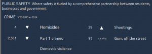
bostonwBoston’s Mayor Walsh has had a public dashboard for more than a year, and is perhaps one of the more attractive ones (one part of which is shown here), with a rotating series of graphics on city performance data. You can see that there have four homicides this year, and compare with last year’s numbers. This is very actionable information too.

You would expect Portland Oregon to have a dashboard, and it does, showing things such as the percentage of renewable energy consumed and other groovy-oriented stats. It is arranged as more of a brochure than a dashboard: so you have to click around to find a particular stat, such as the average response time for a fire alarm is more than seven minutes. You can see in the graph that this hasn’t changed much over the years.

Detroit’s dashboard is more of a book report than an interactive dashboard. This shows you what they have accomplished last week such as how many LED-based streetlights were installed or blighted homes torn down.

London’s dashboard was launched last fall and is just for crime stats. It is chock full of graphs and figures, but you can’t see the whole picture on one page unfortunately.

Denver’s dashboard is more of an RSS portal, and you can customize it to your own particular needs, displaying alerts and news feeds on economic or public safety stats.

LA has several different data dashboards including a “performance” top-line summary that shows single numbers for things such as total employment, non-attainment air quality days, and the time it takes for police to respond to 911 calls. Clicking on any of these items will bring up graphical displays and lots of city rhetoric and more marketing information. There is also an open data project too.

Seattle’s dashboard has a similar design to LA’s, with single number top-line summaries that can be expanded with more graphical detail.

Meetup adds ‘Chip in’ donation feature today

NOTE: This post was written in 2014. Since then Meetup has sadly removed this feature.

Perhaps you know already about Meetup.com, the site that anyone can organize any group on any topic. I have not been an organizer but have attended numerous meetups in St. Louis, and used the site to research people that I wanted to connect with when I traveled to other cities around the world in the past. Today Meetup organizers are getting a new incentive: the ability to add a “chip in” button so that members can donate cash to the group.

“We want to make it easy for supportive members to chip in on costs and help make Meetup groups even better,” according to a post on their blog this morning As of today, any group or event organizer can quickly add this feature. It is a pretty bold experiment and perhaps the widest expansion of crowdsourcing to date. To give you an idea of the scope of this work, there are nearly 200,000 meetups around the world organizing half a million events every month.

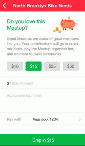
contributions 2The way it works is simple: a Chip In button on the Meetup home page will bring up a dialog box asking for your contribution, as shown here. You enter your payment information and you are done. It works on both web browsers and phone apps.

Meetups are a pretty low-budget affair, for the most part. Many organizers pay for the costs of running the meeting (beer and pizza are the usual enticements) out of their own pockets, or else try to find a corporate sponsor (such as the company who is hosting the meeting at their facilities), but the Chip In feature formalizes this and makes it easier to raise funds. About 2,000 Meetups have already been using the feature and have found it very helpful, as you can imagine. While Meetup.com won’t reveal how much money has been collected, I hear it is quite impressive.

My long-time colleague and friend Tristan Louis has been heading up this effort and he told me, “We’re trying to carefully introduce ways to help the organizers without requiring them to ask the uncomfortable questions surrounding money. We know that organizers often get stuck being the ones paying for the pizza and we want to change that dynamic by having everyone chip in.” Contributions aren’t mandatory, but we’ll see if the psycho-dynamics of the meetup changes as a result of them.

Building your own early warning system


What do a bowl of yellow M&Ms have to do with the Distant Early Warning or DEW line? Both are ways to provide early warning systems of sorts. Let me explain.

The DEW line was a big deal back in its day. The idea was to be notified of any incoming Soviet bombers that were going to take us out by flying over the pole. The system of radar installations stretched across northern Canada and Alaska back in the cold war when both countries were stockpiling thousands of nuclear bombs. It would just take a few minutes for a bomber or a missile to reach our country, hence having a series of detection points closer to the source could provide a few minutes’ warning of an imminent attack.

The same could be said for the bowl of M&Ms. A friend of mine is a musician and explained the typical concert contract riders that specified a particular color of candy present in the dressing rooms or backstage. It wasn’t because the musicians were being prima donnas, as I always thought. “They wrote these riders as an early warning system. If a band showed up at a venue and saw the wrong color of candy, they knew they had better get out to the stage and spend some more rehearsal time. If the venue didn’t read the contract, it meant that other things probably wouldn’t be right for their show. It had nothing to do with their personal preferences,” he told me. Snopes quotes David Lee Roth of Van Halen, who put on some very complex shows, here: “If I saw a brown M&M in that bowl . . . well, line-check the entire production. Guaranteed you’re going to arrive at a technical error. They didn’t read the contract. Guaranteed you’d run into a problem.”

Great idea, I thought. Those old rockers were on to something after all.

I thought about this as I attended the annual Teradata Partners conference last week in Nashville. I have been coming to this show for several years and find it very interesting, mainly because so many IT managers present what they are doing at dozens of sessions. This year’s show was no different, and I heard a lot of folks talk about they have developed their own early warning systems that they have put into place.

For example, what about tracking what happens to your worst customers? These are people that you want to know about, and try to fix their problem before they actually leave you for your competitors. Wouldn’t it nice if you could be notified about some issue in time to change their minds? That is one of the things that Teradata excels at with its various data warehousing and analytic tools.

One British clothing retailer has gone so far to set up its systems so that it can tell when an online shopper is calling its call center trying to complete an order. While that can be borderline creepy, it can help increase revenues and customer satisfaction rates too. Wells Fargo Bank has a number of executive dashboards that are used to track what banking products are used by their customers, as a way to see who isn’t really engaged.

Interestingly, the same systems can also be used to track what is going on with your best customers too.

So whether it is a bowl of candy or some multimillion dollar systems, think about ways that you can detect early trends and keep your customers.

How 7-Eleven Built Its Digital Guest Engagement Program From Scratch

Two years ago, the convenience store chain 7-Eleven had no data warehouse, no smartphone app for its customers, and had a loyalty program that still used paper punch cards. Since then it has built the beginnings of a digital customer engagement program. At the recent Teradata Partners conference in Nashville this week, they described how they did it.

All it took was finding the right VAR and spending some significant cash.

Well, not quite. As you can imagine, there was a lot more involved, given that the company has over 10,000 franchisees throughout the US and thousands more overseas. They first set some important goals:

  • Develop actionable insights into what their customers bought, when, and why. “Prior to this program, we had none of this information,” said Robert McClarin, the senior CRM manager for 7-Eleven Inc. and one of the presenters at the conference session where they described what they did. “We knew we had a tremendous gap in our knowledge.”
  • Develop an initial IT infrastructure that could handle several elements of a total customer engagement platform. While they began with a loyalty program, they wanted something that was extensible for years to come, including a rich data warehouse that is constantly being updated from their point-of-sale system in all their retail stores.
  • Dramatically increase incremental purchases and customer visits. They wanted to build a program that would attract five million members during its first year. They also wanted to justify the expense of the program – which was considerable and in the multiple millions of dollars – with the additional in-store revenues generated, when measured with year-over-year same store sales.
  • Establish a personal relationship with each guest that would be natural and seamless. “If you want to be closer to your customers, you have to be on their smartphones,” said McClarin. More than two thirds of their customers carry smartphones currently, according to store surveys. They also wanted to leapfrog some of their competitors who built early smartphone apps.

Then they put together a three-step program and issued requests for proposals to find the right VAR. They humorously called the three steps “crawl, walk and run.” After getting numerous RFPs, they settled on Brierley+Partners. That company was selected in a recent Forrester Wave report as one of the leaders in the loyalty CRM space. The company is also a Teradata VAR and used several modules for the project. Brierley’s office is located near the 7-Eleven headquarters in Dallas and worked closely with the chain’s CRM and IT staffers to build the first data warehouse and develop the initial smartphone app.

Speaking of which, they spent time to make their smartphone app engaging and yet simple to use. Along with digital coupons, the app contains features such as a store locator function and a feedback area where customers can suggest new features. The user interface is clear and clean, which also helps boost usage.

 Their first foray was to come up with a coffee loyalty program that offered everyone a seventh cup free. The program coincides with a celebration marking 50 years where the chain served up the first ever to-go coffee cups. Since they, 7-Eleven has built quite a business out of selling a lot of coffee – more than a millions cups daily worldwide. Prior to the digital program, as I said earlier 7-Eleven stores used a paper punch card to keep track of these purchases. “Our franchisees were asking us to replace this with a digital program, and so they were very much on board with our program,” said McClarin.

So far the program is very successful: more than 3.2 million customers are part of the program, which is close to target for their goal., since 2,500 customers are joining daily. Year-over-year coffee sales are up for the program participants and the stores that they shop at, and they have given away more than 52,000 cups of free coffee since the program began in March 2014. One good outcome: the program has had no impact on the checkout experience. McClarin said that so far they have made it easier for customers to checkout, even though payments are not part of their app – unlike competitor Starbucks who was one of the first to offer this.

They also have seen a shift in sales to higher profit margin items for program members, and members who are shopping more days per week too. The program offers customized coupons for each customer based on their shopping patterns and is localized for each store too, which increases the feeling that the program is personalized just for that customer. For example, “a coupon could offer a discount on coffee in the early morning hours, fresh food around lunch time, and another discount for DVD rentals at the in-store RedBox video kiosk,” said McLarin.


ITWorld: What is the value of a data dashboard?

When it comes to convincing your boss of the value of a data dashboard, nothing works better than when you can save some dollars as a result of a trend that you visualized. This is what one of the data-driven marketing staff did for the Texas Rangers baseball team; their dashboard saved about $45,000 in annual costs.


The Rangers are big fans of data dashboards, and they should be: dashboards can spot trends, communicate a particular position to management, or call out trouble spots while you can still doing something about it. I heard from Sarah Stone, who is the marketing and advertising manager for the team and also a Big Data junkie.


Stone gave a talk at the annual Tableau Software user conference held earlier this month near their Seattle headquarters; I also met with her separately to get more information about her situation. She told me that she was new to the team’s front office (as they call the folks who don’t actually get into uniforms) and was looking to support one of her colleagues who were involved in a discussion with one of their long-time contractors. Their contract was up for renewal and thanks to Stone’s help they were able to produce a visualization that was used to shave off $45k from the contract. This was a great example of how data science could be used to benefit other marketing and sales efforts.


Tableau Software is big into dashboards and I came across many of them during their conference. One issue is that they can easily overpower management, who may be used to squinting at a series of spreadsheet figures. “The first time you show your boss a visualization can almost be a magical moment, it can really reveal things in your data that weren’t very obvious before,” said a data analyst at a Defense Department contractor I met at the conference. At another session, Vaidy Krishnan, an analyst from General Electric’s Measurement and Control group said, “Dashboards are just a starting point for a discussion. You can’t get everything right out of the gate but using them helps you ask critical questions.”


Stone is the person who has to decide on television and other media advertising buys for the baseball team and has to spend wisely: she needs to know which games are selling slowly, or what kind of ticket buyers are likely to come to which games. To do this, she uses Tableau Software’s tools and connects to several public and private data sources to produce her visualizations.


For example, she wanted to see whether the Dallas market was saturated with professional sports teams and used census data to compare the raw number of seats for each metropolitan market. Not surprisingly, St. Louis (as shown below) showed lots of rabid sports fans (something that I can attest to, after living there for several years) while Dallas still had room to grow.


Another analysis looked at how they could save money on their corporate cell phone bills. She was able to find several staffers who were frequently on scouting trips out of the country, and try to adjust their plan to handle more international minute usage. “We also saw a spike in the bills during August but then figured out that was when the whole team was in Toronto for a series of games, so it made sense.”


Her work on tracking ticket sales is an example of how a typical Big Data analysis session goes. Often, you don’t know what questions to ask or how to go about collecting the data that you’ll need for your analysis. At the conference, Neil deGrasse Tyson, the director of the Hayden Planetarium in New York, gave one of the keynotes where said the “really difficult thing was formulating questions that we are currently too stupid to ask now, let alone understand the answers to.” He gave as an example if someone from the 1700s were to try to figure out when the next asteroid would hit the Earth. No one from that era would have even asked such a question.


Stone admits that she often will run several queries and create several different data dashboards before she figures out what she is trying to accomplish. This is very typical behavior in the Big Data world. She is in the process of putting together an interactive seating chart of their stadium, showing characteristics of which seats were purchased by season ticket holders, what concession sales happened on particular games, and whether promotions or team performance helps to fill seats.


Not surprisingly, all those bobble-head doll giveaways do drive ticket sales. “And a post-season win translates into three seasons of subsequent increased sales,” she told me. Some of the data is downloaded from StubHub, the secondary ticketing retailer that Major League Baseball helped start. She is also working with the local Southern Methodist University business school students as interns to help integrate regression models based on R.


“Our sales department knows what they are doing when it comes to selling tickets, but when it comes to looking more globally at this process and how it coincidences with other variables such as team performance or the weather, they need help.”  For example, her analysis can predict attendance so the team can better staff the stadium for more crowded games.


Before she started, the marketing department had to make frequent requests for reports from the box office, and these reports didn’t reflect real time sales either. “Producing real-time, holistic visualizations is the holy grail. We’ve always been able to obtain real time data, but it hasn’t been all that accessible and only a few people could gather that information,” she told me. “Our seat inventory is very perishable, and if I can design a discount program or arrange for an ad media buy for the next day’s game, it can have a big impact. Having a stale report doesn’t really help if you are trying to move thousands of tickets. We need to know how sales are trending because once the game is over, we can’t sell those tickets anymore.”

Ironically, when she started with the Rangers last year, Stone knew virtually nothing about baseball—she jokes that she didn’t even know the difference between an out and a hit then. (Now her game knowledge has improved to the point where she accurately scores each game she watches.) She came to the Rangers from another competitive landscape: professional politics, where she used data analytics to help focus media buys and to track what the other candidates were doing. “Really, politics and baseball are very similar,” she told me. “Both marketing groups have no control over the quality of the product you are promoting and you still have to get people to either come out to vote or to go to the game. Data is still data.”

#Strangeloop: How sexist are rap lyrics?

jayI went to a computer conference to learn about how sexist rap lyrics are. What makes this all the more remarkable is that the session was given by a woman, Julie Lavoie here in St. Louis at the annual Strangeloop programming conference.

Actually, it kinda makes sense: the idea is to parse the entire corpus of lyrics (there is a site called rapgenius that has compiled this information for hundreds of songs) and do some natural language processing to see what is being said. It was very entertaining, even though I know almost nothing about rap music. (That is Jay Z above, BTW.)

As you can probably guess, the most common words mentioned in rap songs are cuss words, and other epithets that I hesitate to use here and run up my spam scores. But Lavoie started with an interesting hypothesis: what if she searched for a particular word that rhymes with witch and is used as a common term for women. Do the rappers who have a sexist rep use it more often in their songs? How about men vs. women rappers? What about rappers from different geographies or styles of music? (Yes, that was something I never knew.)

Well, she found out that things weren’t so simple: lots of rappers use this particular epithet, and many have far worse things to say about women that are hard for a Python script to process automatically. Do you look for the association of particular action verbs with particular nouns? The mind boggles.

Lavoie at one point had to temporarily stop her analysis, because it was getting her depressed seeing the negative words that were bubbling up to the top of most often used list. But she is a trooper (and also a big fan of rap music, which is why she started the project to begin with). The project got her thinking more about how to characterize sexist lyrics and gave her fuel for further explorations. Granted, she could have chosen French literature or modern poetry, but she likes rap so that is where she focused her efforts.

This is just the sort of thing that you can find at Strangeloop: interesting tech stuff, presented by people that you probably never heard of mixed with the leading lights of major programming languages and open source projects. If the show isn’t on your fall calendar, it should be. Plus, you can come visit me in St. Louis too!

Holding office hours for your end users

I was at the Tableau Software annual user conference in Seattle this week, and one takeaway was an idea that I heard from one of the presenters about holding “office hours” to support your end users. It is an old idea that may be worth revisiting.

Back when I toiled in the IT end user computing fields for Megalith Insurance, we had several staff for our own phone-based hotline to support the insurance agents around the country. That was great for them, because we couldn’t really make house calls. But we had several thousand users in our three office towers in downtown Los Angeles that were only an elevator ride away. These folks had to call us when they were in need or distress and wait for us to get to their offices. We never really thought about holding office hours where the users could drop in, frankly because we didn’t want them to know where we worked. Maybe there was some other reason, I was never quite sure. It was probably because back then we had mainframe programmers in abundance, and no one ever ventured into their holy of holies offices either.

But that was then. Today we all work in bullpens and people bring their bikes and dogs into work. And there are a lot of end-user oriented tools besides spreadsheets and word processors.

And when it comes to a visualization tool such as Tableau, seeing is literally believing. Having a steady hand and someone who knows their way around the interface can make a big difference in speeding up the learning curve for a newbie.

mod2At the Tableau conference, I spoke to Krystal St. Julien, a data analyst with eCommerce retailer ModCloth.com. She comes from a academic biomedical research background, which is why she calls what she offers “office hours.” Only instead of students waiting outside her office door, she schedules her time with Google Calendar. It is working well for her, not just on an efficiency level but on a user empowerment level too. She helps her users over learning speed bumps and gets an entire team up and running with Tableau in record time. (An interesting side note: all of her data analysis department are mostly women, with the exception of the boss. Some lesson to be learned there, too.)

Maybe it is time we bring back this concept into wider use. Who knows, it could help some IT shops over their image problems.


Gigaom webinar: Customer-Driven Infrastructure: Building Future-Ready Consumer Applications

Based on a white paper that I wrote earlier in the year for them, I am holding a webinar next week with the above focus. In this webinar David S. Linthicum SVP, Cloud Technology Partners and Brandon Elliott the Chief Technologist for Rackspace and I will examine the infrastructure needs of customer-facing applications by examining the challenges faced by businesses in the most demanding industries. It will provide a framework for evaluating technology decisions from the perspective of customer experience quality and suggest metrics that can help businesses justify and benchmark the success of their investments.

You can register here for the event, to be held on August 28th.


ITworld: Data artist in residence: Why your data needs an artist’s touch

jerAs more companies hire data scientists, there is a corresponding trend to hire a new kind of employee that some refer to as “data artists,” whose job it is to tell the stories behind the data in the most accessible and revealing ways. And these folks are taking major roles on product management teams, such as Jer Thorp pictured here. In this story for ITWorld today, I talk about what is a data artist and how Microsoft and Google and the New York Times are making good use of them.