This article was written by Jesse Jacobsen, who is a web content writer at TechnologyAdvice. He covers a variety of topics, including business intelligence, project management, and analytics software. Connect with him on Google+.
Most professionals have used bar graphs and Excel pie charts on present data. At its most basic this is what’s known as data visualization, a growing feature of business intelligence software. However, such charts are often too simplistic to convey complex data sets. That’s where today’s advanced data visualization tools come in. With them, it’s easier than ever to manipulate data sets, visualize trends, and find competitive insight. Let’s look at some of the most useful data visualizations, and show how they can provide better insights into your company’s data.
Streamgraph
A streamgraph is a stacked area graph that displays data around a central axis. By assembling the information over a time-based axis, streamgraphs allow users to compare the ebb and flow of different data sets.
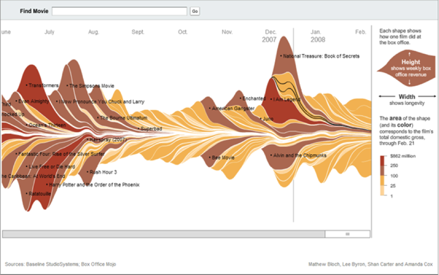 For example, in 2008 the New York Times created an interactive streamgraph that displays the ebb and flow of box office receipts for movies released between 1986 and 2008. It highlights the aesthetic nature of such diagrams, and how they can be used for quickly displaying comparisons.
In addition to being an interesting source for displaying cultural information, streamgraphs can be used to provide business insight. For example, a clothing company sells red, blue, and yellow shirts. By visualizing the daily or weekly sales figures of each shirt, companies can observe how the sales ebb and flow based on the time of day, the day of the week, or even the month. Observations on product popularity can lead to competitive adjustments in inventory ordering, marketing strategy, and even product development.
Treemap
Treemapping is a method for displaying hierarchical data through space-contained, rectangle graphing. This visualization is typically displayed within a larger rectangle, with the surface area divided into segments that correspond to data points.
 Because data in treemaps can be grouped together based on similarities or relevance, this is a great way to visualize categorical data. The Observatory of Economic Complexity did just that in their treemap displaying products exported by The United States in 2009.
By grouping exports into categories like machines, transportation, and vegetable products, this treemap compares diverse data in a way that’s easy to grasp. Companies with a diverse array of products can use treemaps to provide valuable insight into sales data or to evaluate an organization’s budget in a more accessible way.
Geolocating
Geolocation-based visualization modules display data on, you guessed it, a map. While this sounds like a simple concept, different use cases continually demonstrate how this technology can be manipulated to provide business insight.
 Companies commonly use mapping to display store locations or product availability. Many companies include similar mapping capabilities on their websites, which guide customers to the closest store. Many BI vendors take mapping visualization to the next level by including temporal data. This allows users to view geographic trends over time for further insight into behavioral patterns. For instance, Foursquare displayed the “pulse” of New York by calibrating a map to display how commuters use their “check-ins” over the course of a day.
Temporal mapping can also be useful for businesses. If your company is looking to expand to a new city, for instance, temporal mapping (combined with analytics) can provide valuable insight into where the most receptive audience for your product is.
Networks
Network visualization displays the connections of information or systems over time. While network displays can illustrate simple two-way connections, they can also illustrate complex temporal relationships.
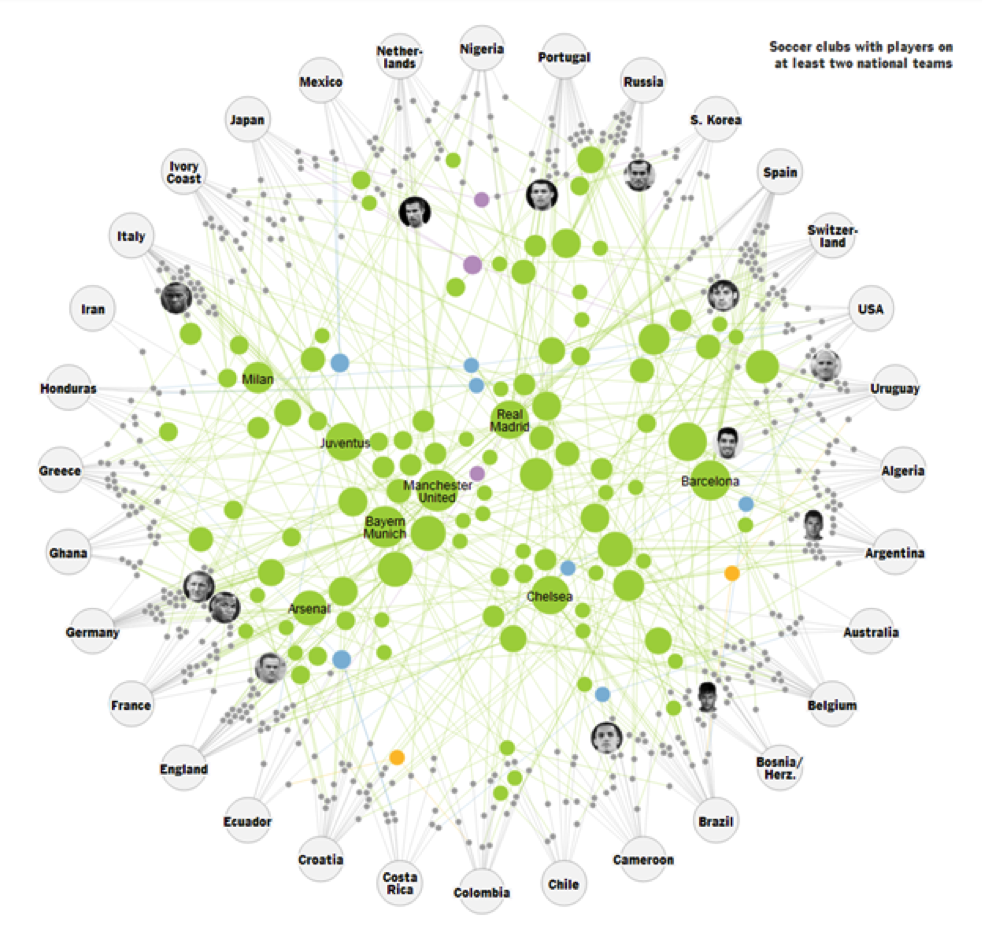 In June, the New York Times created an interactive network visualization that displays how club teams and national teams are connected in the 2014 World Cup. Users can scroll over any information bubble to more clearly see the relationships, including the name of the player that makes the connection.
Network visualization is an effective tool to observe and understand the relational structure of business operations, such as how acquisitions and changes in leadership affected employee retention and division management. Understanding your data through visualization modules can provide you with the information you need to get ahead of the competition.