Those of us of a certain age might recall when Barbie could utter the phrase “Math class is tough.” A good example of this is how to figure out the data transparency in the time of the Covid.
One of my go-to sites is the Covid Tracking Project, which is a group of computer scientists that daily scrape and interpret the thousands of county health stats for testing and infection data. You might have noticed that for each state’s data summary they issue a letter grade for transparency. How they arrive at that grade is instructive, and we should all take a moment to understand the calculations. Even if our business isn’t involved in public health, it can help inform and improve our own transparency efforts.
Just look at some of the recent transparency disasters from last summer, when Facebook and Equifax couldn’t be trusted with showing the truth behind their numbers. We want to be more transparent, because that means we have the ability to create trust with our customers and partners. So let’s look at how the Covid Tracking Project assigns these grades to each state and US territory.
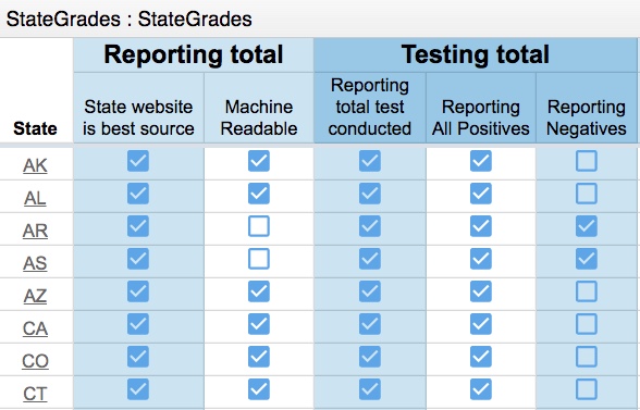 Their transparency grade uses16 different metrics. These include factors such as: is the state’s official health website the best data source and consistently updated? Does the state report patient outcomes, such as how many patients are on ventilators? Does the state break down the demographics into ethnicities, race and pre-existing ill patients? How about total hospital capacity for the state? For each metric, the data quality can vary and the details matter. For example: some states just report positive tests and deaths. For some states, you have no way of knowing how many negative tests were obtained, or how many of those who tested positive then went on to consume an ICU or ER bed or other hospital resources.
The transparency grades are calculated each day: I have noticed that the grade for my state, Missouri, has varied from A to C. Today Nevada, Nebraska and Puerto Rico all have failing grades.
But wait, there is more. The project team also has a Slack channel and a GitHub public project where you can dive deeper into what is going on here. The former is used to address reporter’s questions and the latter is used to call out support or bug issues. The team also has taken pains to explain exactly what they are counting — for example, they look at where people are being tested, which is not necessarily where people first became ill. Every state reports these numbers somewhat differently: some use online dashboards or hyperlinked data tables, while others announce their stats at daily press conferences or via social media posts. The team has taken pains to double-check everything and annotate where things are ambiguous or unclear.
I should mention that the project relies on dozens of volunteers too: so managing all this collaboration is key. Clearly, there is a lot we all can learn from their excellent transparency efforts.
Thanks for sharing this information. It got me to dig deeper into the data.
Using the CDC.GOV web site it is interesting that hospitalization last week the per 100,000 in the US for COVID-19 is 40.4. And the same rate for Influenza is 60.0. So last week about 30% more people were hospitalized for the common flu than CV-19.
Go to each page and scroll down to the heading Severe Disease and look under the Hospitalization column.
https://www.cdc.gov/flu/weekly/index.htm
https://www.cdc.gov/coronavirus/2019-ncov/covid-data/covidview/index.html