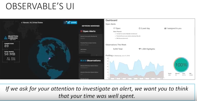
 One of my favorite tech execs here in St. Louis is Bryan Doerr, who runs a company called Observable Networks that recently was acquired by Cisco. (Here is his presentation of how the company got started.) One of the things he is frequently saying is that if a piece of software asks for your attention to understand a security alert, we don’t want to waste your time. (He phrases it a bit differently.) I think that is a fine maxim to remember, both for user interface designers and for most of us that use computers in our daily lives.
As a product reviewer, I often find time-wasting moments. Certainly with security products, they seem to be designed tis way on purpose: the more alerts the better! That way a vendor can justify its higher price tag. That way is doomed.
Instead, only put something on the screen that you really need to know. At that moment in time. For your particular role. For the particular device. Let’s break this apart.
The precise moment of time is critical. If I am bringing up your software in the morning, there are things that I have to know at the start of my day. For example, when I bring up my calendar, am I about to miss an important meeting? Or even an unimportant meeting? Get that info to me first and fast. Is there something that happened during the night that I should jump on? Very few pieces of software care about this sort of timing of its own usage, which is too bad.
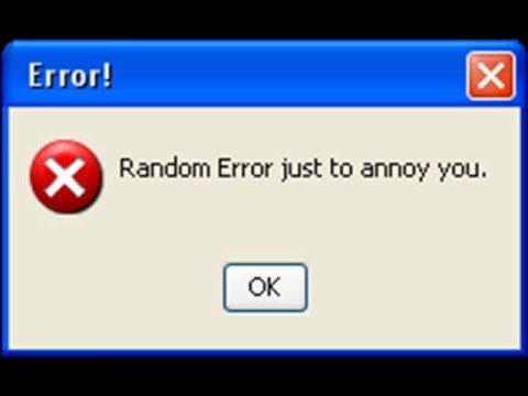
 Part of this timing element is also how you deal with bugs and what happens when they occur. Yes, all software has bugs. But do you tell your user what a particular bug means? Sometimes you do, sometimes you put up some random error message that just annoys your users.
Roles are also critical. A database administrator has a lot different focus from a “normal” user. Screens should be designed differently for these different roles. And the level of granularity is also important: if you have just two or three roles, that is usually not enough. If you have 17, that is probably too many. Access roles are usually the last thing to be baked into software, and it shows: by then the engineers are already tired about their code and don’t want to mess around with things. Like anything else with software engineering, do this from writing your first line of code if you want success.
Finally, there is understanding the type of device that is looking at your data. As more of us use mobile devices, we want less info on the screen so we can read it without squinting at tiny type. In the past, this was usually called responsive design, meaning that a web interface designer would build an app to respond to the size of the screen, and automatically rearrange stuff so that it would make sense, whether it was viewed on a big sized desktop monitor or a tiny phone. If your website or app isn’t responsive, you need to fix this post-haste. It is 2017 people.
Good software is “brainless,” meaning you don’t have to think about it (much). Good management software, like security or backup software, is best when it is pretty much transparent, meaning you can see what it is doing if you want, but you have to make an effort to do so and it does its job without user input (or much management input for that matter). You buy computers and software to save people time!
As to your points, bugs or crashes must be real time and tell the user something happened. Most users won’t be able to figure out what the issue is anyway, so many manufacturers have fairly unhelpful messages for users. Unfortunately, their messages for network troubleshooters are often unhelpful as well. Sigh.
Users don’t care about roles. Roles are a security concern. They worry about access to the work they need to do. The idea is to give people access with a minimum amount of hassle. And, minimum is never enough. People will always complain about security, lose their passwords, etc. So….only “lock up” what you need to and make the keys easy to get to for those who need them. Also, people need to take control of their own safety and security or those roles and security hoops won’t work.
There is a huge demand to do things on phones, but….phones suck at displaying data well. They are simply too small and hard to navigate. They are barely data consumption devices and unsuitable for data production in most cases.
Sometimes the best solutions are simple ones. KISS (Keep It Simple, Stupid) rules. It is often better to say “no” to anything that will complicate management rather than saying yes and dealing with it later.
@David – I tend to agree that this a common area where software of all kinds, in nearly every venue falls short. The failure to really understand what notifications (and other info) our customers really would find useful and when is probably the common denominator behind much of the UX-inflicted pain in the world.
While a certain hardness of hearing on the creators side is part of the reason, I think a deeper cause is a mismatch between the consuming group and the creators – the latter wants to be heard, the former just has a task to accomplish.
You see the same thing happening when a sales person keeps making great points, even after the potential customer has said “ok”. Or when the corporate denizen CC’s the world. Or when a devops guy wants to let everyone know what a great job they’re doing, when in reality the customer would rather live with “no news is good news”, and happily so (oh wait, that’s hitting a little too close to home!).
@Tony – mostly agree with your first two paragraphs; However, the comment about roles is too narrow. While there are security aspects, I think David is using “roles” in the broader context of “different jobs, different POVs, different info needed”.
Also the comment about phones is just incorrect, at least for most cases these days. While tons of screen real estate is great when you can get it, the reality is that mainstream phones circa late 2017 provide more than enough space to present enough data (with drill downs when needed) to make decisions for many cases. Trim out the noise, and what’s left can be more than enough.